
OK, so I thought about it and I think the best way for me to try and show you how I go about doing a painting in the style of the film was to make a tutorial. So I tried doing so. The thing about making a tutorial is that it doesn't necessarily help you do it stylistically. That is up to you. This shows you the technical process of how I did it. I'll try to give tips on rendering style but we're all artists here and ideally you guys should be able to absorb from observing more from me just outright telling you.
Ok so I'm going to tell you how I went from this...
 To this...
HERE WE GO!!!
 Alright so first thing I'm going to show you is how I make the brush I used for the image. You should be able to only use this brush for the rendering of the painting. The brush has a nice texture and when it's small it loses it's texture so you can get into more exact details. First click on the little tab next to the dot where it says "Brush:"
 As you can see it opened up a window where you can select your brushes. on the top right hand corner of the window, there is a little tab and when you press it go down and click on "Dry Media Brushes"
 You should end up with this. Now click on the 4th brush in the slection. You have selected the brush but now we need to modify it.
  You should see a tab that looks like a clip board in the top right hand corner. Click on it and the brushes menu will pop up. Then click on "Other Dynamics". Make sure "Opacity Jitter" and "Flow Jitter" are at 0% and then set them both to "Pen pressure". This allows you to adjust the opacity and flow of the brush with how hard you press with your tablet. It's an excellent tool for blending.
 Now click on "Shape Dynamics" and repeat the process. Make sure everything is at 0% and turn "Size Jitter" to "Pen Pressure". Doing this makes the pressure you apply to your tablet vary the brushes size. Once again extremely useful.
 Now we have the brush we're going to be doing all the rendering with! Ok so now we're going to start painting! Duplicate the line art.
 Then delete the background layer and make a new layer and put it underneath the lineart. Make it a colour. Painting on white is scary because since we are working with a brush that will be mainly somewhat transparent the entire time, whatever you are painting overtop of will bleed through and if it's white than it looks really pasty and not so great. Having a colour underneath allows you to leave some parts possibly untouched while still maintaining a somewhat finished looking peace. Now adjust the "Fill" of the line art to 25%. It doesn't have to be 25%, whatever you feel comfortable with is cool. Just as long as you can see what's going on beneath it because it is going to be used as a reference tool rather than anything you'll be painting on.
  OK so now I blocked in the shapes of the background. At this stage I keep the line art on while I paint so I know where everything is. Don't render the characters, that's not our job :P
 Once things start getting more defined I then remove the line art and then just turn it on from time to time to keep myself on track. From here on it's just rendering basically. Thinking about where the light is coming from, what colours I should use.
  After a bit I begin to shrink the size of my brush for smaller details. Just like in life drawing, you start out with long strokes and the as your drawing becomes more finished. you start to use smaller strokes to get into little important details.
 More refinements. Note that it is all on one layer. This is how I work. You don't have to. Use as many layers as you need. Just make sure you keep the look because that's what's important.
 Alright now I'm satisfied with the painting and now we're going to do some polishing work. Make a new layer on top and set the layer to "Overlay". Overlay layer deals with saturation. Whatever colour you put on top will make whatever beneath it, more saturated in that colour.
 We won't be doing the polishing with the brush we made though. We'll be using an airbrush because doing the polishing with the dry media brush we had will look really odd and patchy. With an airbrush it can flow and act more as a gradation rather then making blocky strokes. So go click on the tab next to the brush icon in the top left hand corner and click on "Airbrush Soft Round 50% Flow"
  So with this try and make your shadows darker and your lights lighter and more saturated. Particularly in the focal point region. If you aren't comfortable with your results you can always adjust the "Opacity" or "Fill" of the layer.
Ok and now for one more polishing technique. Save it. Then merge the layers together and go to "Image" - "Adjustment" - "Color Balance".
 Here you can adjust the shadows, mid tones and highlights of the image. Clicking on "Preserve Luminosity" makes your adjustments effect the brightness and contrast of the image. If you leave it off, it strictly adjusts colour. I like to adjust the levels in my images when I'm done with them but if I keep preserve luminosity on, I can skip that step and get the colours I want and the amount contrast in one go. So the way it works is when you click on shadows, you then control the hues of the shadows in the image in accordance to where you pull the arrow on the bars above. Same goes with mid tones yadda yadda yadda, you aren't idiots. Now a tip for this. Make sure your shadows and highlights are different warmths. for instance don't make your shadows blue and your highlight cyan. The colours lose their punch if you do that. Stick to the laws of painting and make your shadows warm or cool in accordance to the colour of your highlights.So there ya go! Note that the party lights are left without any rendering. This is because Ben will be doing the lighting effects in Flash afterwards.
IMPORTANT THINGS TO NOTE!!!
HOT KEYS!!!
ALT while on your brush tool turns it into the eyedropper tool. EXTREMELY helpful. This allows you to borrow the colours around you with great speed and therefore not interrupting your thoughts while you are in the zone of painting.
ALT while on your brush tool turns it into the eyedropper tool. EXTREMELY helpful. This allows you to borrow the colours around you with great speed and therefore not interrupting your thoughts while you are in the zone of painting.
F!!! pressing F turns your Photoshop into "Professional Mode" allowing you to move around your image easily with the Space Bar. Another extremely helpful tool. To get out of "Professional Mode" just press F until you're back to normal.
Ctrl+SHIFT+Z is "Step Backwards". I'm sure all of you already know this but it's worth noting due to it's importance.
"[" and "]" control your brush size. from 1 to 10 it changes by 1 size and from 10 and up it changes by 10s.
Holding down Ctrl and pressing - or + changes the zoom of your image.
Ctrl+SHIFT+Z is "Step Backwards". I'm sure all of you already know this but it's worth noting due to it's importance.
"[" and "]" control your brush size. from 1 to 10 it changes by 1 size and from 10 and up it changes by 10s.
Holding down Ctrl and pressing - or + changes the zoom of your image.
Ctrl+E merges your selected layers and Ctrl+SHIFT+E merges all visible layers.
A technique I like to use that I find really effective is what I like to call "Carving". For example if I make a line and want to give it more weight by adding more volume to it. I can use the colour around it to dig into it to help form the way I want.
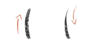 See how I make one black line. Then I carve into it with white. This is basic and I hope I'm not making it seem like I think you guys are dumb or something haha. I just think it's good to mention something like this. Carving goes into anything really. Trying to get the crisp edge when lines meet and whatnot.
Renderingwise...
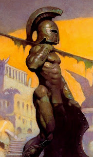 Notice that when he makes the texture on the form, it doesn't only vary in shape but in colour. some parts are green while others are purple. I think this is very important to consider when rendering the stones of the worn down cathedral.
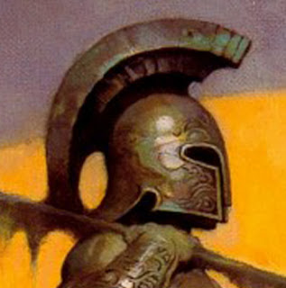 Close up. BEAUTIFUL!!! I will NEVER get tired of this guy's work. Look at that turquoise at the tip of the helmet and just throughout it all. The yellows, the greens, the purple. And notice his highlight on the helmet isn't strictly one shape. It applies to the texture of the helmet. Same with the highlights on the rocks. They need to follow the texture. Now I know I didn't show the best example of that in this tutorial but it is something to keep in mind.
Well I hope this helps for those of you who are painting. If you have any more questions. Just ask!
In terms of rendering I think the importance is on the texture. We are mainly dealing with old rock and worn down stone. Now this means we'll have to vary up the tones throughout the surface of the form not only with light and shadow but with colour. Now the best example I can show of this is Frank Frazetta's way of doing it.
 Notice that when he makes the texture on the form, it doesn't only vary in shape but in colour. some parts are green while others are purple. I think this is very important to consider when rendering the stones of the worn down cathedral.
 Close up. BEAUTIFUL!!! I will NEVER get tired of this guy's work. Look at that turquoise at the tip of the helmet and just throughout it all. The yellows, the greens, the purple. And notice his highlight on the helmet isn't strictly one shape. It applies to the texture of the helmet. Same with the highlights on the rocks. They need to follow the texture. Now I know I didn't show the best example of that in this tutorial but it is something to keep in mind.
Well I hope this helps for those of you who are painting. If you have any more questions. Just ask!
5 comments:
Really nice detailled instructions, thanks
damn son
beautiful! great tutorial garrett!
that should be plenty to help everyone get the look.
very minor thing probably due to the characters blocking the lineart but the bandstand stage should extend to the far left wall. the mid window wall and left window wall should connect.
again, great work.
Nice tutorial broski, two beeeeefs though! when you set your "overlay" and say use that to punch the saturation in your lights and shadows, you shouldnt handle your shadows in that layer because you dont want to add saturation to areas of shadow, you want less saturation,(that being said you rock my socks so do whatever works to look good)
Also a tip for people setting up using ALT as an eyedropper and SPACE as a moving around tool, I find it ideal to setup both of those as your tablet pen buttons (if you have intuos with the fingertip 2 buttons) that way you can grab you paint while painting and not have to think about what your other hand is doing other then brush sizing/opacity..
I also think you need some dirty ground texture to make it looks a little more detailed up front. If you make a hair brush (dots) then space it out and set it to scatter you get a nice "dirt" brush.
Hello. This post is likeable, and your blog is very interesting, congratulations :-). I will add in my blogroll =). If possible gives a last there on my blog, it is about the Dieta, I hope you enjoy. The address is http://dieta-brasil.blogspot.com. A hug.
Post a Comment